About
We partnered with a well-regarded North American leader in homeschooling. The company has delivered high-quality online education for over two decades, empowering families and children across the continent.
Homeschooling Learning Platform
BusinessNorth America
Location
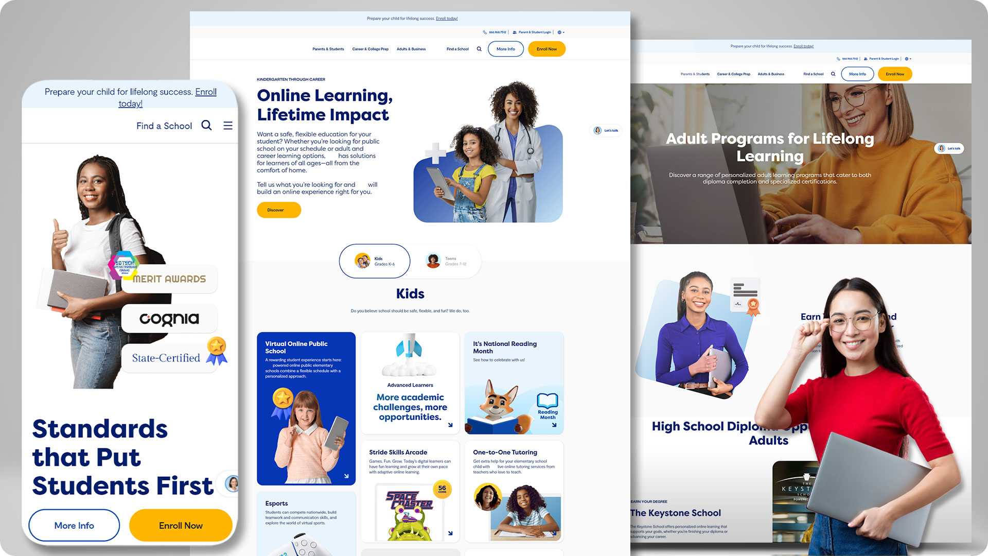
The homeschooling organization sought to update outdated content and complex navigation to appeal to new and existing students and increase conversions.
Brief
We transformed customer engagement by leveraging the Adobe Commerce platform to enhance product design web experiences and optimize conversion rates. By integrating chat features and AI-powered recommendations, we elevated the brand’s online presence with gained data insights, ensuring a more compelling and efficient user journey.
List of Services Offered
- Adobe Commerce Implementation
- User experience
- Website optimization
- Chat platform
- UI/UX
Enhanced UI/UX Experience
Features
Significant Rise In Relevant Traffic After Content Organization
We transformed a disorganized website into a user-friendly experience with clear navigation and streamlined enrollment processes. By providing visitors with the required information faster, the website saw increased traffic from relevant users. It also resulted in a significant increase in course enrollments, leading to a direct boost in revenue generation.
Implemented Chat For Smoother Enrollments
Our team enabled a provision to answer parents’ queries about enrolment faster. By implementing chat, the company could resolve queries in real-time, thereby aiding parents in making faster decisions. This streamlined communication significantly improved enrollment by providing immediate support and fostering trust with potential customers.
Reduced Submenus For More User Clarity
We eliminated website users’ confusion with fewer submenus. With the right number of submenus, the decision-making process was faster. To address this, we implemented concise menus, presenting users with a streamlined selection of options. This clarity significantly improved user experience by making navigating the website easier and quickly finding the needed information.
Boost In Processing Data For Better Decisions
Our team worked on centralizing data from multiple sources for better analysis and execution. By consolidating diverse data streams, we enhanced our ability to extract valuable insights and execute strategies more precisely. This strengthened the firm’s capability to respond better to market trends and customer needs.
Technology Stack
Front-end Tech
Server
Back end
Database
CRM
Swift
Java
Angular
NodeJS
Similar Projects!
Deliver amazing customer app experiences
Boost your conversions with top-rated UI UX services from Brainvire!
